All You Can Eat Website Design
 Not so long ago you couldn’t click on a menu item, all you could do was order it and hope it tasted good enough to swallow. The intuitive process that has allowed us to know, for example, that the symbols or words near the top of a web site are actually gateways to other pages is one of the quiet revolutions of graphic design. And, we’ve come a long way—or most people have—from blue links and the Courier New font. In fact, we’ve come so far that people now describe what they want in a web site design like they’re ordering some fine French wine: “I’d like a really contemporary and fresh looking site, delicately bolstered with a timeless and classy essence and supported by subtle hints of a dynamic and edgy hipness, which are trendy without being flashy. It should blossom with a vibrant–but not garish– color palette that finishes cleanly but crisply with a wisp of navigational intuitiveness that blends seamlessly with my lingering text content.” Wow, that’ll pickle a few pixels.
Some Food for Thought
We’ve built many websites out of nothing more than descriptions like that. Sure it sometimes takes a bit longer, but eventually we get down to speaking your language. We find, however, that the process is quicker if you simply point us in the direction of some sites that you like. It’s not like we’re going to copy them, but we can a better idea of what “fresh” and “classy” mean to you by seeing it for ourselves. Another trick to making the site design process is to have a stable plan from the beginning. Do you like your menu items across the top or down the side—and how many do you need: do you need sub-menus? Do you have pictures that have to go in a certain place? Need a newsletter sign up? We need to know, and it’s better to know at the beginning rather than adding a major design component in when the layout is already all but completed.
Cooking and Chopping: What to Expect During the Design Process
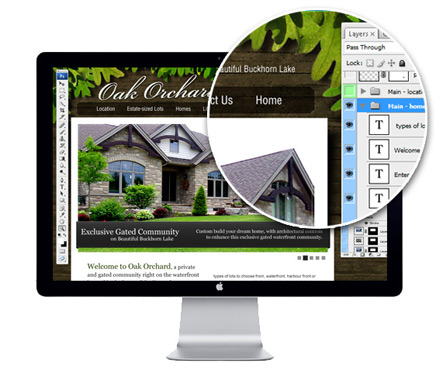
You see, professional website design begins with a mock-up, usually done in Photoshop. It’s just a picture: a graphic representation of what your site might look like. When we come up with a great design, we send that mock-up to you. You tell us you love it, you hate it, or that you could love it with a few changes. Then, once you’re completely happy with this photograph of your website, our team begins the process of “chopping” up that picture and converting as much of the design to HTML as possible and then putting the whole thing back together, like a puzzle. There are a few reasons why we go through this “chopping” procedure. First, many smaller pictures take far less time to load in a browser than one large picture. Secondly, since the search engines can’t ‘read’ pictures (not even text that’s in a picture), we convert as much of your layout as possible to the internet language HTML, which search engines can read. All these pieces–pictures and HTML blocks– have to be pieced together, positioned on the page and styled—hence the puzzle. After this is complete, it’s still possible to make major design changes, but it takes more time and work, because sometimes we have to start the puzzle process all over again. It’s a bit like ordering a car and realizing after it’s delivered that you really wanted a four-door, not a two-door. That takes a lot more time to fix than, say, re-painting the car if it was delivered in the wrong color. By the way, you don’t need to worry about the text and pictures in your content area, or the names of your menu items; those are always easy to change, especially with our CMS.
The Take-Home Box
The bottom line is, like anything else, the more you think about what you want in your web site during the initial stages and the better you communicate those ideas into a plan, the quicker, easier and cheaper the creation of your site will be. So write us a novel, tell us a story or show us some pictures and get the most out of all the latest design features that are possible with today’s Internet.